The Challenge
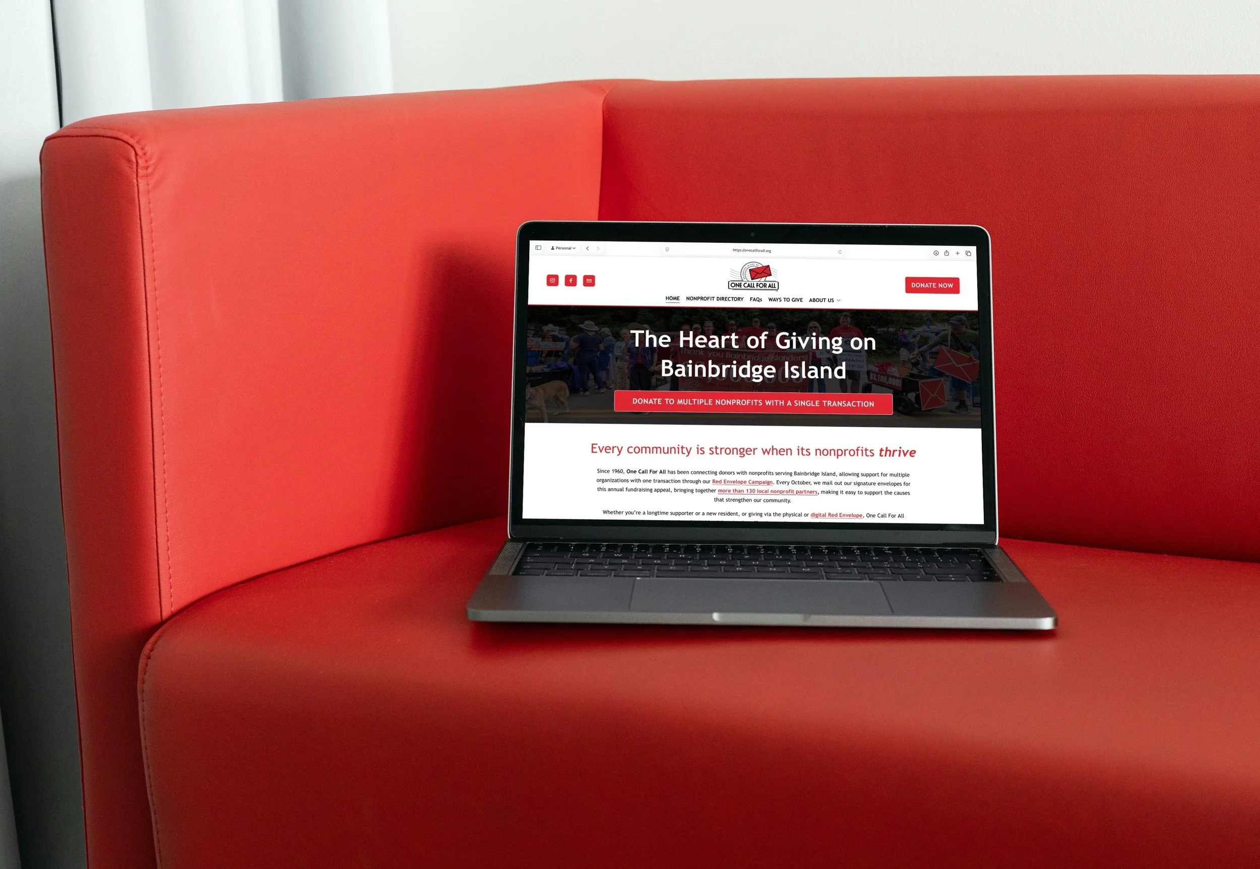
One Call For All came to us with a website that contained a wealth of important information, but the digital experience didn’t fully communicate the heart of their mission. As an organization built around making local charitable giving easier and more connected, their website needed to better showcase their role as a bridge between donors and nonprofit organizations.
The existing site was very information-forward but lacked strong visual branding, color, engaging graphics, and imagery that helped visitors quickly understand who they are and why their work matters. Additionally, their nonprofit partner pages — a key part of their fundraising model — needed a more polished, organized, and visually appealing format to better support the organizations they serve.
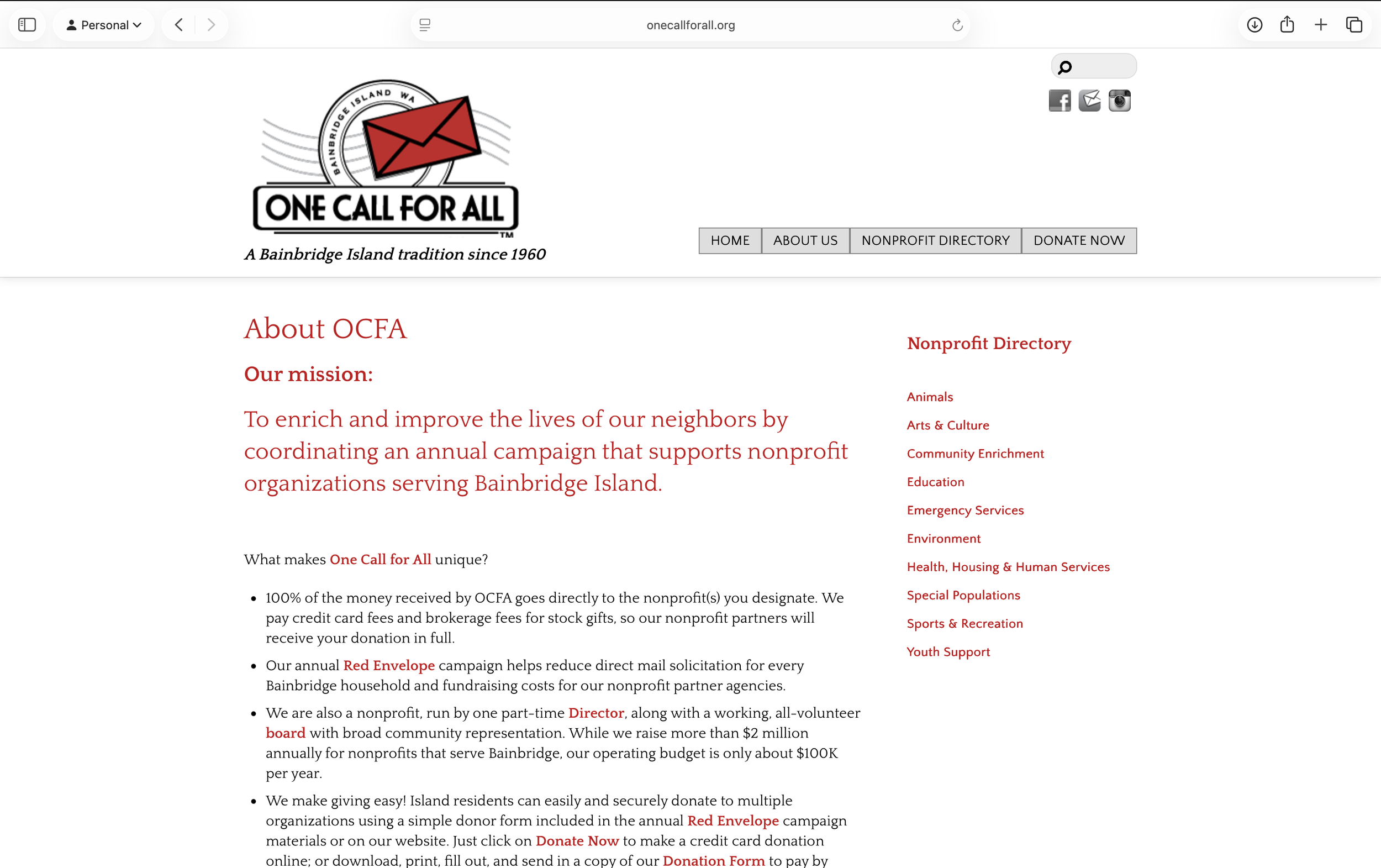
Before
One Call For All’s previous website was built around sharing important information, but the experience felt heavily text-based and lacked the visual storytelling needed to connect with its audience. The site had limited graphics, imagery, and brand-forward elements, making it difficult for visitors to quickly understand the organization’s mission and the impact of their collective giving model.
With a large amount of content and a complex page structure, users could feel overwhelmed when trying to find information, explore nonprofit partners, or understand how to get involved. The organization pages, which are a key part of connecting donors with local nonprofits, also needed a stronger visual foundation to better showcase each partner’s mission and encourage giving.
The Solution
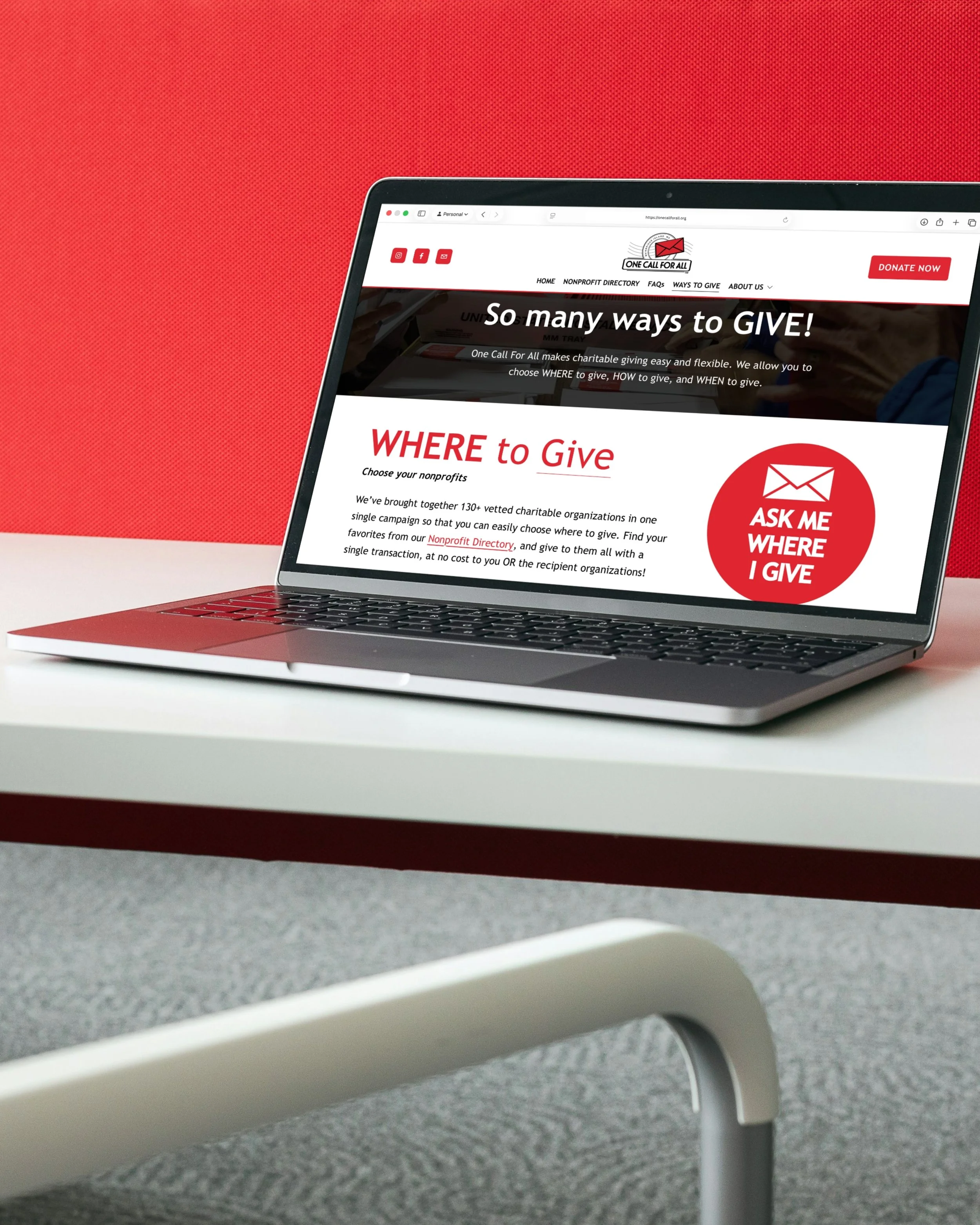
We partnered with One Call For All to refine their brand and completely rethink their website experience. The goal was to create a digital home that felt more welcoming, mission-driven, and easy to navigate while helping both donors and nonprofit partners better connect with the organization.
We introduced a stronger visual identity through refined branding, expanded use of color, custom graphics, and intentional imagery throughout the site. We also restructured the website by reducing unnecessary pages and simplifying the user journey, making it easier for visitors to understand the campaign, explore nonprofit partners, and take action.
Key Accomplishments
Website Redesign & Simplification:
We streamlined the website structure by removing pages that created confusion and reorganizing content around the needs of their primary audiences: donors, nonprofit partners, and community members. The new layout makes it easier for visitors to understand how One Call For All works and how they can participate.
Nonprofit Partner Page Redesign:
We redesigned the organization pages that showcase participating nonprofits, creating a more engaging and organized experience. These pages now provide partner organizations with a polished space to share their mission, connect with donors, and encourage giving through the campaign.
Enhanced Visual Storytelling:
We integrated more graphics, brand imagery, and visual elements throughout the site to move beyond an information-heavy experience and create a more memorable, engaging platform.
The Results
One Call For All now has a website that better communicates the heart of their mission and the impact they create for local nonprofits. The refreshed brand presence and simplified website experience make it easier for donors to understand the campaign, discover organizations they care about, and feel connected to their giving.
Their nonprofit partners now also have beautifully designed, easy-to-share pages that better represent their work and help drive support. The result is a more cohesive digital experience that strengthens connections between donors, nonprofits, and the community as a whole.