
The Challenge
The team at PNW Peeks offers a truly special experience — helping families connect with their little ones through ultrasound. But their existing branding didn’t reflect the warm, personal, and memorable environment they work so hard to create. They also felt that their social media presence didn’t match the emotional depth or professionalism of their services.
They came to us looking for a visual identity that felt heartfelt, earthy, and timeless — and a content strategy to help them show up more consistently and meaningfully online.
The Solution
We set out to completely reimagine their brand while honoring the beautiful moments they’re a part of every day.
Key Accomplishments
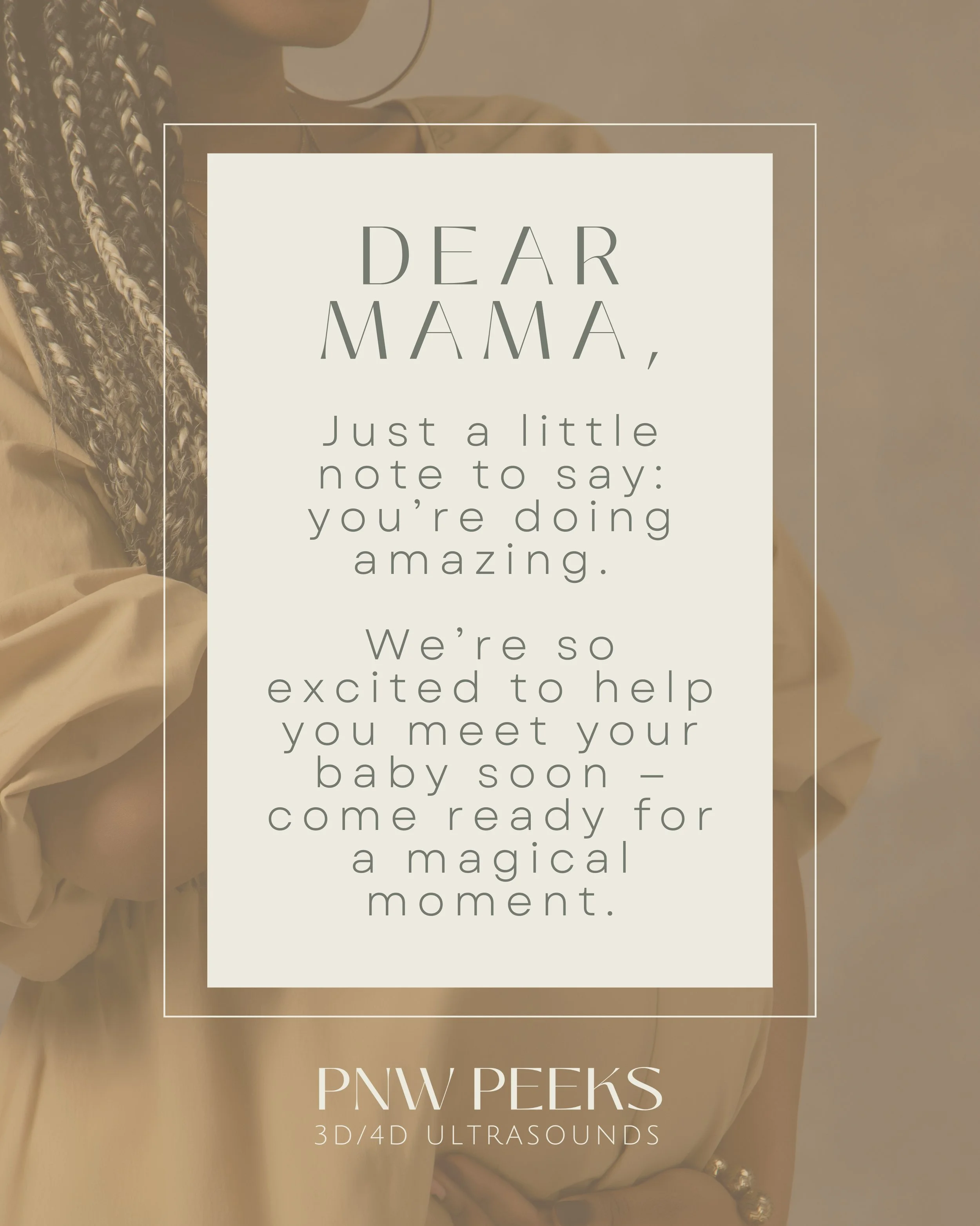
Social Media Template Suite:
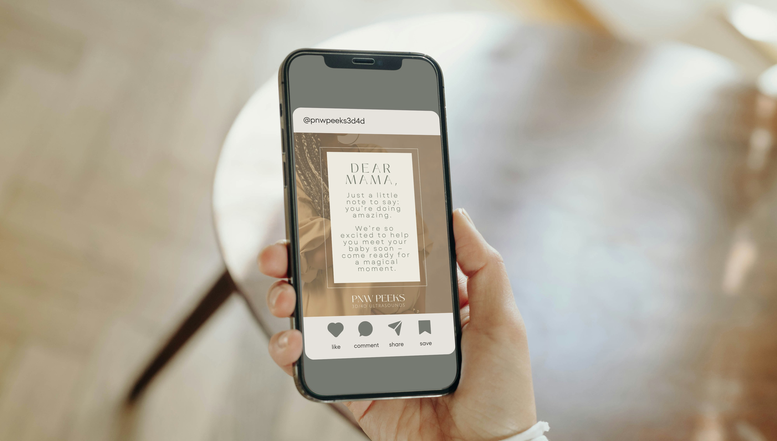
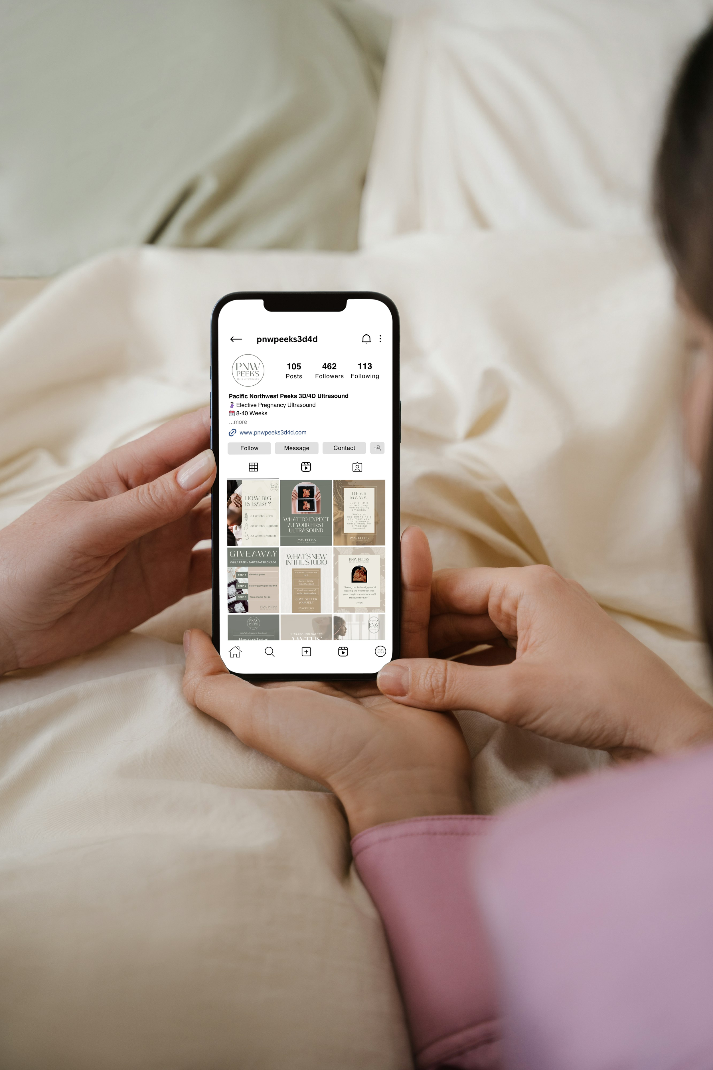
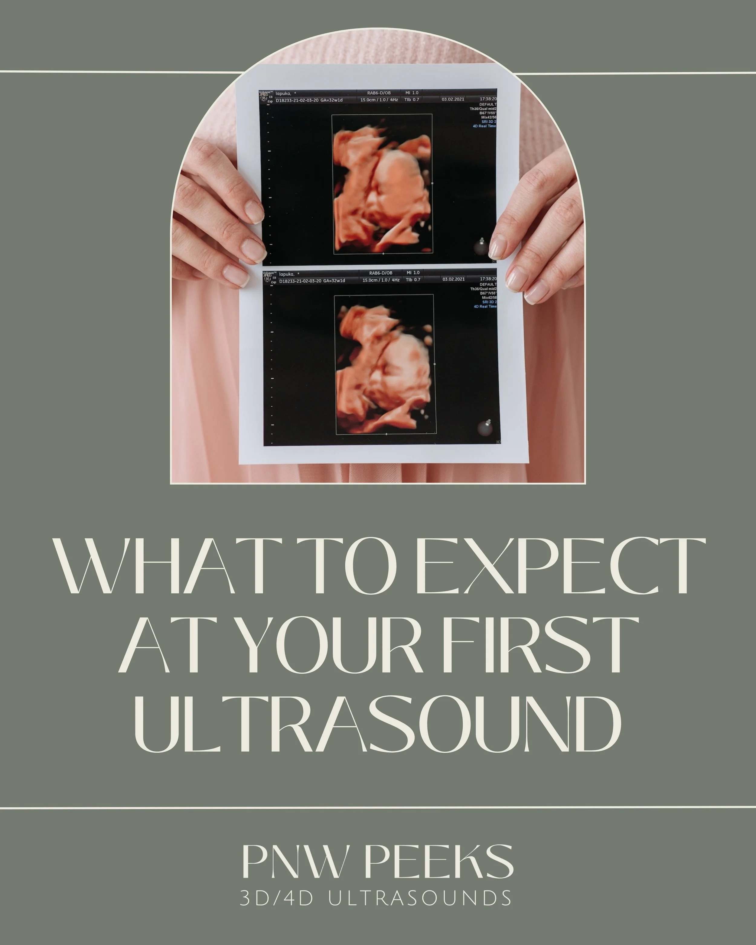
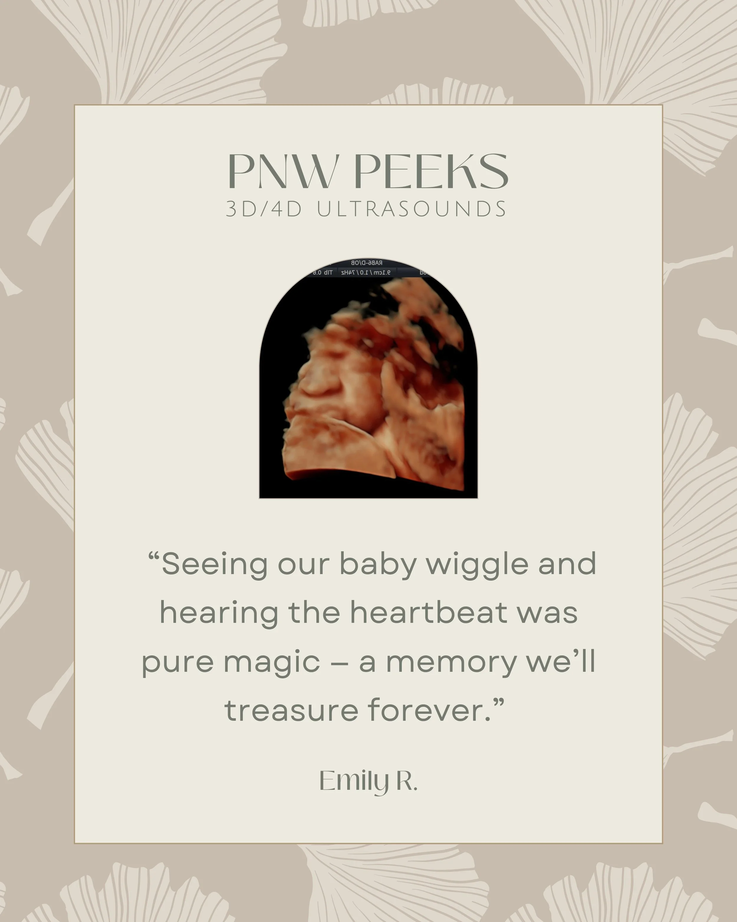
We designed a custom set of 50 Canva templates, each aligned with the new brand. These included options for showcasing ultrasound packages, appointment availability, testimonials, educational info, and heartfelt client moments.
With variations included, the final suite totaled over 120 templates, giving their team plenty of flexibility to create consistent, engaging content that requires less time and effort to produce.Consistency Across Platforms:
Every visual element was designed with adaptability in mind — ensuring PNW Peeks could stay consistent across Instagram, Facebook, printed materials, and beyond.


Brand Identity Redesign:
We began by building upon PNW Peeks’ already established brand colors — warm, earthy tones that naturally reflect the comfort, emotion, and connection at the heart of their business.
From there, we created a primary and secondary logo set that reflects softness, care, and professionalism. The logos were intentionally designed to feel calm and comforting, with gentle curves and thoughtful spacing, while still maintaining a timeless, elevated look that will grow with their business. To support the new identity, we also introduced a custom font suite — a blend of modern serif and clean sans typefaces — that balances approachability with clarity, making every piece of content feel consistent, thoughtful, and aligned with the emotional depth of their work.

The Results
PNW Peeks now has a brand that feels like home — one that matches the heart-centered work they do and helps them communicate more consistently and clearly with their community. Their new logo suite and template system have brought a fresh sense of confidence and cohesion to their online presence, helping them build trust with every post.
This case study highlights how intentional design and strategic tools can bring a brand’s heart to life — both online and in person.
